Thursday, May 5, 2011

the color fever *

LĂ©on Gimpel, Balloon show at the Grand Palais, 1907
Lt Col. Mervyn O'Gorman, his daughter Christina at Lulworth Cove, 1913
O'Gorman was also a pioneering aviator, motorist and Superintendent of the Royal Balloon Factory

Mrs. Benjamin F. Russell, Lady in a greenhouse, 1910
I cant find any further information about Mrs. Benjamin F. Russell
although she has some other unusual autochromes out there.
Charles Zoller, Arnett YMCA interior, ca 1916
Charles Spaeth, woman in silk robe, ca 1915
Jean-Baptiste-Tournassoud, girl in a hammock, 1909
Heinrich Kuhn (above two) ca 1910
Anonymous, ca 1915
Autochrome, invented by the Lumiere brothers, French moving picture pioneers, was the first industrial process for color reproduction. Thus true color images became next in the line of French landmark inventions beside the daguerreotype and, come to think of it, photography itself. On June 10, 1907 the autochrome became commercially available after Messrs. Lumiere made the first public demonstration. I believe it remained the only color process until the arrival of Kodachrome in 1935.

It was a rather complicated affair to create autochrome plates, and hence, expensive.
"Microscopic potato starch grains were separated into batches, dyed red, green and violet, mixed together and spread over a glass plate coated with a sticky varnish. Next, carbon black (charcoal powder) was spread over the plate to fill in any gaps between the colored starch grains. A roller submitted the plate to a pressure of five tons per square centimetre in order to spread the grains and flatten them out. Finally, the plate was coated with a panchromatic photographic emulsion....A summer landscape taken in the midday sun, required at least a one second exposure. In cloudy weather, this could be increased to as much as ten seconds or more. Spontaneous ‘snapshot’ photography was out of the question, and the use of a tripod was essential.”—The Royal Photographic Society
Professional photographers and artists were agape and took to autochrome's pointillist effects, which were in perfect step with the romanticized Pictorialist art sensibilities of the day. (Upper middle class hobbyists took to it too, producing floral still lifes ad nauseum.)//

Autochrome colors flicker between hazy indeterminancy and saturated flashes. The images have such an ethereal almost fleeting quality about them, like the partial recollection of a dream. The fugitive aspect is paradoxical of course since these images have been fixed, however precariously, for a hundred years...
...........................................
further reading:
Steven Kasher gallery
photographymuseum.org

Flickr set
Read about the amazing Albert Kahn collection of some 72,000 autochrome plates—
part of his wildly ambitious attempt at an ethnographic "archive of the planet."

* “It’s the greatest thing that ever happened to photography,” Alvin Langdon Coburn told Alfred Stieglitz in 1907, "I have the color fever badly."
“Soon the world will be color-mad," said Stieglitz.

Sunday, March 27, 2011

Billheads of Distinction

"Telephonic connection"
This kind of wiry, loose lettering is typical for the late 1880s to early 1890s.
Beautiful combination of lettering and scrollwork reminiscent of stock and bond designs.
Possibly one of my favorite lists of items of all time.
"Dixon's Plumbago" has a wonderful ring to it.
This forlorn hulk is all that's left of the New York Architectural Terra-Cotta Co., and it sits in the shadow of the 59th Street Bridge, in LIC. It it the small building on the right in the vignette above.
Virtuoso lettering! 
Outrageous exaggerations of scale! 
Innumerable smokestacks belching forth prosperity! 
Curious products touted with sincerity and grandiloquence!

Find them here:

Thursday, March 10, 2011

horror vacui— a fond look

"Mrs Leoni's Parlor" 1894— part of a series of NYC interiors by Byron
Ophelia by John Everett Millais, 1852-53
A reblog with updating

I've been thinking about Victorian painting— specifically about the pre Raphaelites and their hallucinatory hyper-realism (its difficult to use "realism" in conjunction with these paintings of knights errant and damsels). The shrill colors and the complexity of the details are fascinating to me at the moment. Something in my head is percolating about the artist Meghan Boody and the updated pre Raphaelite vision —but who knows if I'll be able to say any more than just that.

A 20th century art historian remarked on the pre-Raphaelite tendency toward "blade-by-blade" painting-- that is rendering each and every line and form in equal detail. Filling the entire canvas with detail, filling a page with 9 different typefaces and varieties of ornament, filling an entire room with dainties, what-nots, and doodads— a Victorian inclination and equal illustration of horror vacui.
Horror vacui - "fear of emptiness" or empty space is a term I love. The phrase carries with it intimations of mania and compulsion —covering every surface, interweaving pattern atop pattern. Perhaps it can be as loosely interpreted as Collyer Brothers piles or the noisy and noisome claustrophobic streets of Dickensian London. Somehow, though, I relate the term to an overall sensibility. A complex density with an awareness of the whole, not an open-ended haphazardness. But I'm not sure if this is really the case.

I came upon these rather amazing photographs
taken by Philip Henry Delamotte (above), in about 1859, of the later incarnation of London's Crystal Palace Exhibition of 1851. (After the exhibition closed it was moved to Sydenham Park and rebuilt, which is what is shown here. It remained standing until it burned, November 30th 1936.) The Crystal Palace exhibit was a kind of World's Fair, an enormous display of technological and cultural achievements. Though international in scope, it was sort of Britain on parade. ( I believe it was in the 1850s that the term "Victorian" solidified into a cultural identity.) The exhibition opened the floodgates for all manner of manufactured ornament, embellishment and gewgaws.

About this same time, Richard Dadd, locked away in a London hospital for the criminally insane, began the first dabs of Fairy Feller's Master Stroke, below left, and then continued for nine years.
For the rest of the 19th century (and into the 20th) great moral debates raged over "taste" and the "proper use" of ornament. And in the midst of that, many people's houses ended up looking like this "Parlor, 11 West 45th Street, New York, 1896" (taken from the wonderful The Tasteful Interlude: American Interiors through the Camera's Eye, 1860-1917 by William Seale). Called a Japanese Parlor, the nook features a "Moroccan" inlaid table, Turkish- inspired seating and cushions, most likely a Persian carpet, and no less than four window treatments.
J.K. Huysmans' Au Rebours ("Against Nature"), published in 1884, is practically a recitation of the senses; a literary horror vacui in which words stand in for the over-stimulated eye sweeping across every surface:
"In other days, when he was still in the habit of inviting women to his house, he had fitted up a boudoir where, amid dainty carved furniture of the light-yellow camphor-wood of Japan, under a sort of tent of pink Indian satin, the flesh tints borrowed a soft, warm glow from the artfully disposed lights sifting down through the rich material. This room, where mirrors hung on every wall, reflecting backwards and forwards from one to another an infinite succession of pink boudoirs, had enjoyed a great renown among his various mistresses, who loved to bathe their nakedness in this flood of warm crimson amid the aromatic odours given off by the Oriental wood of the furniture.../ The dining-room, draped in black, opened out on to a garden metamorphosed for the occasion, the paths being strewn with charcoal, the ornamental pond edged with black basalt and filled with ink, and the shrubberies replanted with cypresses and pine. The dinner itself was served on a black cloth adorned with baskets of violets and scabious; candelabra shed an eerie green light over the tables and tapers flickered in the chandeliers. While a hidden orchestra played funeral marches, the guests were waited on by naked negresses wearing only slippers and stockings in cloth of silver embroidered with tears..."
While not a literal transcription of synesthesia, it renders the effect.

Sunday, February 20, 2011

A word from our sponsor*

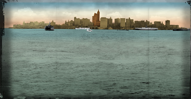
the show's "logo" has the Hudson, the East River, Penn station, the NY skyline, a train and three typefaces.
That is probably a record
I created this as a mural in the show. It is pieced together from three 1908 skyline scenes like (but not including)
the one below. I then added more water, colorized, and distressed it.
tunelling under the Hudson
West Street ferry terminals (The Pennsylvania Railroad one is in the far center, with a flag)
The small exhibit I designed for the New York Transit Museum opened last week. The show is in the Transit's space in Grand Central Terminal, in the "shuttle passage."

A fair bit of the installation deals with the simultaneous mind-boggling feats of engineering that went into creating Pennsylvania Station: 
tunneling under the Hudson River
tunneling across Manhattan
tunneling under the East River (to connect to the LIRR)
buying up several blocks of the West side of Manhattan
demolishing those blocks
blasting and excavating while shoring up the elevated subway, trying not to kill anyone
Then building the nine-acre structure.

Before the Pennsylvania Railroad got the bright idea to try to continue their train tracks into Manhattan, everyone had to disembark in New Jersey and change to a ferry. Arrival in New York would find you in the rather no-nonsense ferry dock. A weary cross-country traveller might very well collapse when the porter said, "So long! Dont take any wooden nickels!" as he left you in the midst of the chaos that was West Street (see above)...  If you are passing Grand Central please go take a look— the exhibit is free.
*Design is how I make a living. In a manner of speaking, the museum and its show have contributed to the pleasure of my having a roof over my head as I update this blog. Thus, it is an unofficial sponsor.

Tuesday, February 8, 2011

Cheap thrills

Gold hat ornament set with six foiled rose-cut amethysts and seven diamonds.
The reverse is enameled in black and white.
Pendant cross, gold, set with foiled and trap-cut spinels bordered by table-cut diamonds and cabochon emeralds
Gold hairpin set with turquoise
Pendants, hair ornaments, etc. as modelled by Elizabeth I
The Cheapside Hoard contains over thirty necklaces of various lengths.  
The hoard was particularly fascinating because typically objects of gold and gemstones were sent by their owners to be reworked periodically, even when not damaged by wear. As a result, extremely few pieces of common, non-royal jewelry survived in the original state into the 19th and 20th centuries.
Two flower shaped rings in the Spanish fashion, one with seven cabochon emeralds, the other enameled and set with garnets. Two gold rings set with sapphire. Center, gold ring set with a large table-cut diamond in a white champlevé enameled gold setting.
Gold pendant or hat ornament, with foiled flat and fancy-cut amethysts,
enameled on reverse.
Gold pendant in the form of a bow set with fancy-cut and trap-cut foil-backed rubies and table-cut diamonds. Called a 'flower' in Elizabethan times, it was often attached by a ribbon to the left breast.
Below it, a hat ornament in the form of a salamander with cabochon emeralds and diamonds,
many of which are missing. The tongue is also missing.
These images are just a few items from a cache of approximately 500 pieces of jewelry and loose gems at the Museum of London known, rather inelegantly, as the Cheapside Hoard. “Cheapside", both a street and a district in London, originates from the word "chepe" (or "cepe," or "cheop") meaning 'barter' or 'market.' Beginning in the 11th century, the area was known for its food market as well as for shops of various trades. Goldsmith's Row (near Poultry street, Iron Lane, etc) ran between Bread Street and Friday Street and was the center of the gold and gem trade.

Long after the jewelers left and the area changed, on June 18, 1912, workmen started demolition at 30-32 Cheapside, a derelict tenement 300 years old or more. Workers got down to the cellar and when they broke through the floor they unearthed what has been called the finest collection of Elizabethan and Jacobean jewelry in the world. They'd found the house stock of a jeweler, buried under the floorboards since the early 1600s.


Evidently it was common, until 1970 or so, that laborers would come across all sorts of archaeological finds across the city—which they would then bring to a certain dealer
to make a few easy pounds. Journalist Henry Vollam Morton described the tradition in the 1920s:
"I cannot count the times I have been present when navvies have appeared and passed their treasures across the counter with a husky, “Any good to yer, guv’nor?” I have seen handkerchiefs unknotted to reveal Roman pins, mirrors, coins, leather, pottery and every kind of object that can lie concealed in old and storied soil. I was with him one day when two navvies handed over a heavy mass of clay found beneath a building in Cheapside. It was like an iron football, and they said there was a lot more of it. Sticking in the clay were bright gleams of gold. When they had gone, we went up to the bathroom and turned the water on to the clay. Out fell pearl earrings and pendants and all kinds of crumpled jewellery. That was how the famous hoard of Tudor jewellery, the Cheapside Hoard, was discovered."
The 'Vauxhall pastes' (faceted glass paste gems whose flat backs were mirrored)–
the cabochon, bezeled and table-cut garnets, emeralds, turquoise, diamonds, sapphires–
the 30 or more chains of delicate knots, scrolls and foliate links, tiny details picked out in colored enamel–
the gold rings and salamander hat ornaments–
sat buried in the cellar while the plague passed through and the Great Fire of 1666 raged (above),
while America was found, then lost,
and Victoria came and went...
And now you can see them.

Thursday, January 27, 2011

Eric Ravilious Carried On

the Knife Grinder
Eric Ravilious’ unpublished design for the Adhesive Stamp Centenary, 1940

Some of the subject icons Ravilious created for Everyman's Library.
These and more at the Collecting Everyman's Library site

shopfronts done for High Street, 1938

Ravilious was attracted to the light and radiance of the Sussex Downs
Not to forget he was an artist during wartime, this landscape is titled "Shelling by night", 1941

Eric Ravilious (1903—1942), British painter, designer, book illustrator and wood engraver, was inspired by the Sussex Downs of Southern England. His watercolors of the chalk paths and gentle scenery of the area are both serene and slightly discomfiting. There's an echo of the American Regionalism style of the same time, but Ravilious never seems to veer into what I think of as the Americans' fairy tale robustness or swirling animism. His is a quiet mysticism, drawing power from the ancient landscape and particular light.

Ravilious' commercial art on the other hand has a homey cheerfulness. There's a wonderful "Carry On" celebration of Britishness and day-to-day life in his series of storefronts, published as High Street by the Curwen Press. (All 24 lithograph views from High Street can be seen
here.) He did work for Wedgwood with an extremely appealing child-like sensibility. He created wood cut spot illustrations, patterns and icons for the popular "Everyman's Library" imprint and designed for London Transport, among other highly visible —and quotidien—clients.

Ravilious was also an "Official War Artist"* during WWII  and received a commission in the Royal Marines. He was killed in September 1942 on a rescue mission with the Royal Air Force in the North Atlantic off the coast of Iceland.//


An excerpt from a beautiful essay by British essayist and travel writer Robert MacFarlane (which I found here):
Ravilious…Downsman, follower of old paths and tracks, lover of whiteness and of light, and a visionary of the everyday…’The Downs’, he wrote once, ‘ shaped my whole outlook and way of painting because the colour of the landscape was so lovely and the design so beautifully obvious’. ..He made expeditions, slept out and walked for hours following the lines of the Downs, their ridges, rivers and tracks…
The light of the Downs is distinctive for its radiance, possessing as it does the combined pearlescence of chalk, grass blades and a proximate sea. If you have walked on the Downs in high summer or high winter, you will know that Downs’ light also has a peculiar power to flatten out the view – to render scattered objects equidistant.... In these respects the light of the Downs is kindred with another flattening light, the light of the polar regions, which usually falls at a slant and is similarly fine-grained. The light and the path: the flattening (the light) and the beckoning (the path). These are Ravilious’s signature combinations as an artist.
* Did the United States have Official Artists for the war? Any war? It seems so odd— 'go out while people are getting killed and sketch.' But there were official photographers I suppose...