Friday, April 2, 2010

Connecticut sketches


For a brief moment I thought perhaps I should write a post about the new UK Space Agency logo or some other topical, relevant subject I've pondered recently. But then almost nothing of what I've written on this blog has ever bowed to the dictates of timeliness or relevance, so why start now. And so:
C O N N E C T I C U T
Historical Collections,
containing a
General Collection of Interesting Facts, Traditions,
Biographical Sketches, Anecdotes, &c.
Relating to the
History and Antiquities
of Every Town in Connecticut,
with
Geographical Descriptions.
Illustrated by 190 Engravings.
by John Warner Barber.
 second edition.
New Haven:
Published by Durrie & Peck and J.W. Barber,Price: three dollars. *
1838 

I purchased this book for a few dollars at a local flea market not too long ago. It was gratifyingly cheap because the condition is so poor— the cover has fallen off, the fold out map is barely tethered to the spine, and virtually all the pages have foxing or are totally discolored. But every page is intact, including one at front with an inscription in brown ink ("H. P. Havens/ bo't 28 March 1838). I like the heft of the book, the substantial rustle of its 550+ cottony pages, the dark whorls of its marbled end papers. 

The numerous little engravings are of a piece: restrained, bucolic, charmingly naive. Within this engraver's earnest but narrow visual repertoire, most every town in Connecticut looks like another: white steepled churches and a few plain buildings set amidst gently rolling hills, enlivened, now and then by a coach, or a chimney belching smoke, that curious 19th century conceit that signals prosperity and purposeful diligence.

Content is a hodgepodge of pedantic identification ["South view of Fair Haven (western part.)"], colorful local lore (there's a surprisingly empathetic Indian presence), liberal use of extracts from old newspapers and town records on a seemingly random array of subjects, and curiously, transcriptions of epitaphs "copied from the monuments" in local burying grounds. This last practice appears to be de rigeur for the author, Mr. JW Barber, for imparting to his readers the true essence of each town: past highlights, if you will. An inscription found in Tolland:
Cap't Amos Fellows was captivated [sic] by ye British troops on ye Island of New York, Sept. 15, 1776, and was closely confined for several months, and there suffered repeated hardships, probably insupportable, died in captivity Feb. 16, 1777, in ye 48th year of his age. His remains are there still, and that his memory may be perpetuated, this monument is here erected by his son. A tribute of a tear is due to him who in his country's cause has lost his life.
Here's one for Molly, a young woman who died in 1792, aged 24:
Molly, tho' pleasant in her day,
was sudd'nly seiz'd and sent away.
How soon she's ripe, how soon she's rotten,
Laid in the grave and soon forgott'n.
Mr. Barber comments on the "rather unrefined" sentiment in that one.
Our author/narrator/tour guide compiled and edited this text in 1837, long ago in our past, but it isn't the 1830s that we learn much about— it's the people of his past that come most clearly into view. Barber relates or reprints many a stirring episode from the Revolution or from Colonial days, and a good number of odd and dramatic local anecdotes of fifty or a hundred years previous. When he returns to his own time, his narrative powers fail him and we're more likely to hear about the height of high tide or the situation of the local quarry.  

In Wethersfield we learn in detail about the tragic Beadle family murder-suicide: mother and five children "consigned over to better hands" by the father, who was "impatient to visit his God."
 

In Ridgefield we get the sad back story of Sarah Bishop, hermitess:
Her father's house was burnt by the British, and she was cruelly treated by a British officer. She then left society and wandered among the mountains near this part of the state, where she found a kind of cave near Ridgefield, where she resided till about the time of her death, which took place in 1810. She sometimes came down to Ridgefield to attend public worship on the Sabbath. It is said that the wild animals were so accustomed to see her, that they were not afraid of her presence. The following account of a visit to this hermitess, is taken from a newspaper printed at Poughkeepsie, in 1804. "She was without form. Her dress appeared little else than one confused and shapeless mass of rags, patched together without any order, which obscured all human shape, excepting her head, which was clothed with a luxuriancy of lank grey hair depending on every side, as she had formed it, without any covering or ornament. When she discovered our approach, she exhibited the appearance of a wild and timid animal, she started and hastened to her cave, which she entered, and barricadoed the entrance..."
Among the many extracts from old newspapers are several advertisements in this vein, reprinted without comment from the author :
Litchfield, Oct. 6, 1761.
Notice is hereby given, that there is now in Litchfield gaol, a mulatto fellow who calls himself Caesar Sambo, about 5 foot 10 speaks good English, well made, sprightly, about 25 years of age: says he is free... he was traveling without a pass...
A Likely Negro Wench and Child to be sold. — Inquire of the Printer. To be sold by the subscriber, of Branford, a likely Negro Wench, 18 years of age, is acquainted with all sorts of House Work; is sold for no fault. June 15, 1763.
 -----
*In 1838, this book cost $3 (or about $71 in today's money according to this site). I paid not too much more than the original price.

Friday, March 26, 2010

Mudlarking

During a trip to London some years ago, a friend took me for a walk along South Bank. This was before the Tate Modern opened and things were still a bit ragged around there. So when we unexpectedly took stairs down to the shoreline and he told me to watch out for "treasures," I was skeptical. (Not to mention totally unprepared to continue our walk out onto gummy black mud.) But I became practically giddy with excitement when within a brief 10 minute amble and absolutely no exertion on my part I found the bowl of an 18th or 19th century clay pipe (which I gave to my friend), and three distinctive pottery shards, above. (The blue ones are almost certainly mid-nineteenth century, the green is a mystery—1930s? medieval?) That afternoon remains one of my best excursions. It's a mystery to me why it's taken me so long to try to replicate that experience. And its only recently I learned the term for what I was doing that day...
Behind St. Katherine Docks, 1952


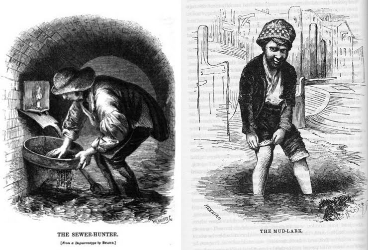
Mudlark: the word was late 18th century slang both for a pig, and for one of the scavengers working the banks of the Thames. Human mudlarks would root around along the foreshore of the river during low tide, searching for lumps of coal, bits of old iron and other detritus that fell from ships — anything which they could sell for a few pence. They were Dickensian characters—but were vividly captured from life by Henry Mayhew, a pioneering social journalist in London Labour and the London Poor (1851). The children (mudlarks were usually under fifteen, but old women would troll the shore as well):
....[were] scarcely half covered by the tattered indescribable things that serve them for clothing; their bodies are grimed with the foul soil of the river, and their torn garments stiffened up like boards with dirt of every possible description.
Today, London's Society of Thames Mudlarks comprises about 60 people in overalls, gloves, and rubber boots who have official permits (browsing along the shore is fine for anyone, but digging needs a permit) to comb the river foreshore with metal detectors.* In Thames, the Biography, Peter Ackroyd lists some of the items the river has yielded to chance and modern mudlarks:
A cup of Trojan origin was found by two dredgermen at Barn Elms, a Greek rhyton of the second century BC was found at Billingsgate...24 Viking swords have been retrieved from the Thames... in one small area just east of Blackfriars Bridge, some 250 medieval pewter pilgrim badges were discovered. In 1834 a bronze head of the emperor Hadrian was found near London Bridge.
       The Thames seems to contain the debris of the world—bird cages and urethral syringes, watches and wooden stools, pipes and phials and wig curlers...A flint hand axe might share the same stretch of river bed with a sixteenth-century pot and a nineteenth century bicycle wheel... In the ancient river all time is redeemable, past and present suspended together in intimate association.... the river is a great depository of past lives.
Ackroyd's meandering story of one of the world's famous rivers is a dreamily evocative and anecdotal sweep of history. He calls the river "a reliquary"—a container or shrine— and it is, not only in the metaphorical sense. The Thames's thick, viscous mud is low in oxygen and as a result, organic decay is greatly minimized. Metal objects retrieved from the depths look, after a swift polish, about as they did when they were dropped in. 
Somewhere there are still blackened remnants of the Great Fire or a commemorative token that slipped out of a hand during a Frost Fair (one of several times the Thames froze over and tents with food and drink, and games of archery and bear-baiting were set up on the ice). I could happily spend my time looking for those... The web site for the Mudlark Society breaks this poetic reverie just a bit. There is no romanticism on these fluorescent green pages. The site revels in fart humor, abounds in misspellings and is one of the ugliest I've ever come across. And yet... there is a fantastic array of documented finds to pore over and the chief mudlark, Steve Brooker, seems like a pretty fun guy. I intend to sign up to go mudlarking on my next trip to London.


Thames Frost, Abraham Hondius, 1677


view from Isle of Dogs, Lorna Richardson, Thames Discovery Programme
 . . . . .
If I would drink water, I must ... swallow that which comes from the river Thames, impregnated with all the filth of London and Westminster. Human excrement is the least offensive part of the concrete, which is composed of all the drugs, minerals, and poisons used in mechanics and manufactures, enriched with the putrefying carcasses of beasts and men, and mixed with the scourings of all the washtubs, kennels, and common sewers within the bills of mortality.
 –The Expedition of Humphry Clinker, Tobias Smollett, 1771
 . . . . .
Mudlark finds, including medieval shoe soles and a coin bearing the image of Faustina Augusta who was briefly empress of Rome in 221 AD. These six preceding images from Thames and Field Metal Detecting Society
*Forget shopkeepers, Britain seems to be a nation of amateur metal "detectorists". Take, for instance, Terry Herbert who in July '09 uncovered a tremendous cache of Saxon gold just below the surface of a cultivated field in south Staffordshire.

Monday, February 15, 2010

Arsenic, Sheep's Dung, and a Yellow called Pink*

 
From top: Ignaz Schiffermüller's chart of blue color samples, Vienna, 1772.
Moses Harris's Natural System of Colours, London, 1766 
Richard Waller, "A Catalogue of Simple and Mixt Colours with a Specimen of Each Colour Prefixt Its Properties," in Philosophical Transactions of the Royal Society of London, vol. 6 for the years 1686 and 1687  
Tray of jasper trials, ca. 1773-76, Josiah Wedgwood

I'm surprised the Church never outlawed color. Not only because of its sensual enticements and potentially corrupting power but because pigments seem to have been so unnaturally poisonous. There is something almost allegorical going on there. The toxicity of these precious distillations was astonishing: the rich golden yellow called orpiment, and the pure brilliant orange, realgar, prompted early 15th century painter and writer Cennino Cennini to write "Beware...lest you suffer personal injury...look out for yourself." In the 19th century Carl Wilhelm Scheele tinkered with compounds of arsenic and devised what would become an enormously popular green. Unfortunately, Scheele's green and a similar "emerald green" proved potentially poisonous: if exposed to dampness, it decomposed into arsine, a toxic gas. It was said Napoleon may have died in part because of the exhalations of his green wallpaper.

All of the incredible images here are from a stunningly detailed monograph The Creation of Color in Eighteenth-Century Europe by Sarah Lowengard, online in its entirety through Columbia University Press and Gutenberg-e. Lowengard examines the scientific experimentation which led to color discovery and the subsequent implementation. In the Age of Empiricism optics, physics, chemistry, taxonomy and naming, diagramming all came into play in the creation of color. Taste, of course, was also a motivating factor. Demand for popular colors such as pompadour, Saxon green and nankeen were offered by the dyehouse (textile), pottery and pigment (paint, ink) workshops. Thus there were the different characteristics each color took on in the different media, and each creation's fugitive or stable nature to consider.

Another color text to consult is a lecture given by Phillip Ball, a noted English science writer, author of Bright Earth: The Invention of Colour (which I have not yet read), among other books. This is a far broader and briefer work. Ball skips lightly and effortlessly from the earliest color designations to Medieval minium to William Perkin's creation of Mauve from coal tar. Ball cites the science of color and each pigment's chemical properties but raises many philosophical points as well. The progression of Medieval religious art, for instance, was in some ways motivated by the creation of vermilion. The product of yellow sulphur and silvery mercury, the brilliance of this red automatically called for other colors in the palette to follow suit and match intensity. Another fact to consider: the switch to an oil base paint from the quick-drying egg tempera allowed the softer modelling and shadows of Renaissance art. It is quite interesting to think that the extreme cost of, or arduous labor involved in, one pigment versus another, or the xenophobic response to a color's origins (ie "The East") could sway taste, commerce, and art itself.

* In the 17th century, the word pink was used to describe a shade rather than a color and often meant a greenish or yellowish color.

The creation of pigments and dyes proves ceaselessly interesting to me. The ingredient lists, the labor, the outlandish processes are a fascinating window into an age when people had a different conception of time...

Dye process for Turkey red on cotton
John Wilson An Essay on Light and Colours, 1786

1. Boil cotton in lye of Barilla or wood ash.
2. Wash and dry
3. Steep in a liquor of Barilla ash or soda plus sheep's dung and olive oil
4. Rinse, let stand 12 hours, dry
5. Repeat steps 3– 4 three times.
6. Steep in a fresh liquor of Barilla ash or soda plus sheep's dung, olive oil and white argol.
7. Rinse and dry
8. Repeat steps 6–7 three times.
9. Treat with gall nut solution
10. Wash and dry.
11. Repeat steps 9 – 10 once.
12. Treat with a solution of alum, or alum mixed with ashes and Saccharum Saturni (lead acetate).
13. Dry, wash, dry.
14. Madder once or twice with Turkey madder to which a little sheep's blood is added.
15. Wash
16. Boil in a lye made of soda ash or the dung liquor
17. Wash and dry.

Friday, February 12, 2010

a bit of tonic


Cup of Tea, 1905
Bonne Fille, 1906
Helen Carte, 1885

 
Les Petites Belges (Young Belgian Women), 1907
La Hollandaise, c. 1906
Mornington Crescent nude, contre jour, 1907
 2 versions of Ennui, c. 1914
 
La Giuseppina, 1903-1904
A painter I've always liked from afar is Walter Sickert. I say from afar because I never sought out a biography or treatise on him, it was simply that each time I came across one of his works I took note. I am always drawn to his colors: smokey, tenebrous, sharp, acidic. In my mental storehouse of aesthetics, mood and color, however, his choices were always relegated to the appealing but problematic section. His subjects lay in the working classes, the music hall stage, the decadent and alien exoticism of Venice, and most notoriously, in the seamy bed-sit flats of Camden Town and the prostitutes who toiled in them. The moods he captured ranged from the cheerfully tawdry to quiet grimness to the palpably brooding. It wasnt his subject choice that I found problematic, it was something about the atmosphere he conjured up—insistently and consistently—in each work. Is it the sense of remove? Is it the voyeurism? Airlessness? A bit of Sickert is tonic, dwell too long in those visual spaces and one feels a creeping discomfort.

Sickert was born in Munich to a Danish father and an English mother, but grew up in England. After a brief career on the stage, he became an assistant to James MacNeill Whistler. After 1890 he went to Paris and studied with Degas. Sickert's return to London in 1905 was followed up with a series of nudes that have become inextricably linked with the Camden Town Murder mystery. These paintings and Sickert's perverse sense of self-promotion (calling, for instance, a very equivocal scene of a weary clothed man and sleeping(?) naked woman alternately "What shall we do for the rent?" and "Camden Town Murder") ultimately led to the preposterous theorizing of author Patricia Cornwall that Sickert was Jack the Ripper.

Recently I read a brief but brilliantly written essay about Sickert by Max Kozloff*. In it is one of the most expertly evocative descriptions of color:
...It would be hard to imagine a more distraught monochrome a more neurasthenic sobriety. Whether in its resiny or vaporous distillation, the paint molds into umber purple, degraded violets, emaciated brownish greens, diseased oranges, prussic, somewhat mildewed blues, the whole occasionally enlivened with little splutters of toned-down white, cream or mustard.
Somehow I find degraded violets incredibly enticing. Perhaps this speaks to my fascination with Farrow and Ball color charts and my longstanding wish to be paid to research and name colors.

* update: I should note that this essay is in an obscure and out of print book, The Grand Eccentrics (From Medieval to Contemporary: the eccentric in painting, sculpture and architecture). Many thanks to Malcolm Enright who pointed me to this fascinating collection of essays. An uneven, and in some ways flawed, book it is never the less a terrific storehouse of some great writing and invaluable facts about some of the most riveting figures in art. The book deserves its own post and I will try to collect my thoughts and write one asap.

Thursday, January 14, 2010

I'd like to thank the Academy...


Finding of Moses, 1904, Lawrence Alma-Tadema

Betty Blythe as the Queen of Sheba, 1921


Theda Bara


Phedre, 1880, Alexandre Cabanel

Intolerance, 1916, D.W. Griffith

Cleopatra Testing Poisons on Condemned Prisoners, 1887, Alexandre Cabanel

King of Kings, 1927, Cecil B. DeMille

The Ten Commandments, 1923, Cecil B. DeMille

Pola Negri

Pollice Verso (Thumbs down) 1872, Jean-Léon Gerome


Have you ever noticed the languorous, sloe-eyed ladies in certain late 19th century paintings seemed oddly like... silent film extras? And those fever-pitch historical tableaux, the overwrought gestures.... there's something familiar about them? Recently, some stylistic details and gestures in "academic art" caught my eye.

Academic art as you may know, is the rigorous, technically brilliant, representational art officially sanctioned by the French Académie des beaux-arts and celebrated during its heyday—the 19th century. (So codified and laden with narrative detail is the typical academic work that to look at it is to understand by default the revolutionary vision of van Gogh or Degas.) By the 20th century, academic art was lampooned by the intelligentsia and arbiters of high culture. Many critics today would still consider it the epitome of Victorian kitsch, a pantomime, preposterously sentimental— the equivalent of mass market book jacket art or Thomas Kincaid, Painter of Light.

Academic art's characteristic "licked finish"— the virtuosic handling of paint that removes all trace of the brushstroke– helped fuel 19th century painters' battle with the camera (the dispute was something like this: The camera recorded reality with unquestionable accuracy--but was it art? science? where did this leave painting?). Jean Auguste Dominique Ingres instructed his students that in the academic technique,
"The brushstroke, as accomplished as it may be, should not be visible: otherwise, it prevents the illusion, immobilizes everything. Instead of the object represented, it calls attention to the process: instead of the thought, it betrays the hand."
A couple months ago, I had a conversation with a former curator from the Dahesh Museum, the quirky little museum of 19th century academic art formerly on Madison Avenue (but now, sadly, without exhibit space). I mentioned my observation that some characters in these paintings reminded me of silent film. "Oh yes," he said, "DeMille was a collector. And in lighting and staging, Gerome* was especially influential." Of course! Then it all made sense! Although in some cases decades separate artwork and film, the commonality is obvious. 

As academic painting lost status in high art, its stagey historicism remained popular with the masses. The Victorian melodrama, Orientalist fantasies, and sentimentality of the 19th century seeped into the 20th, and carried on in popular culture — in certain ways all the way to the 1930s. The conventions of Victorian art became a starting point for film drama. So in a sense Ingres' dictum that the  brushstroke
not "prevent the illusion" had been taken to its furthest degree: the brush and canvas have been eliminated, all that is left is illusion.

Jerusalem/Golgotha, Consummatum Est, 1867, Jean-Leon Gerome

*Gerome's searing vision of the crucifixion, above, is astonishing for leaving out the actual subject. Like some bizarre anticipation of film noir, the angle, and the "off-camera" lighting, create a scene of portent with light and shadow.

New:


Israel in Egypt, 1867, Edward John Poynter
A reader, Marc, sent a link to this incredible image. The wikipedia description of it reads, in part, "Poynter conflated features of the temples of Thebes, Edfu and Philae, backed by the Great Pyramid at Giza and the limestone cliffs of Thebes, to serve as the cinemascope-like background" (my emphasis)

Saturday, January 9, 2010

Swiss watching


Yes, I am just now posting on this book, Corporate Diversity*: Swiss Graphic Design and Advertising by Geigy 1940–1970. Yes, I realize everyone else wrote of it back in the Spring but I only recently purchased it and it has taken me a while to finish reading (The book was published to accompany an exhibit of the chemical company Geigy's work at the Museum of Design, Zurich. See some nice images of the exhibit, including the one above, on Flickr by Arne Sanger.)

The story of Swiss design is intertwined with that of one of its prime movers– the chemical company Geigy. There are several reasons why Geigy became the face of what some called "International Style" of design: First, it was a very successful multinational company and had the resources to create graphics standards and, presciently, a corporate image that would carry its reputation to the rest of Europe and America. Second, Geigy’s products–dyes, pesticides, pharmaceuticals– were abstractions, and needed design to give form to essentially "invisible" entities. Lastly, much of Geigy's output was aimed at and marketed to a select– yes, elite (something that was to haunt Swiss design in later years)– educated market: scientists, doctors, engineers.

Starting in 1941 the Geigy "propaganda department" set about creating the first in-house corporate image team, producing advertising as well as package, product, and even exhibit design. The company saw design as an international representation of Swiss ideals, thereby injecting a sense of nationalism into the endeavor as well. Importantly, the company had close ties with the art school in Basel, becoming a training ground for graduates as it benefited from an influx of fresh academic thought.


European design had been drawing from avant garde movements such as deStijl, Bauhaus, and Constructivism for years. Geigy style-- and by extension Swiss style-- was categorically described by the company itself as, "grounded in the zeitgiest of modern art... function-dependent... [with] no borrowing from past styles." All of which makes a point brought up in passing so fascinating: the accusation (observation?) that Swiss style (by the 70s and 80s) had sold out its radical roots, that it began in avant garde modernity and ended in a corporate capitalist strait jacket. That of course is over-simplifying the matter, however, like modernist architecture, modernist design done on the cheap and without background knowledge, is soulless visual blight. And it was just about the time that designers were rejecting (or at least questioning) the dogmatic Swiss aesthetic that I started my design training, such as it was.

In the chapter on Swiss design's spread in the US, Yale, one of the earliest and more influential graphic design programs set up in this country, is talked about quite specifically. The program was completely allied with Swiss style, even instituting a summer course of study in Brissago, Switzerland. I was at Yale taking design courses in the 80s—but as an undergraduate, and I realize thats a pretty big qualifier. Still, several of the graduate school faculty taught undergraduate, and the few classes offered were a total immersion in grid systems and reductionism. I didn't have Paul Rand but I did have Alvin Eisenman who was head of the graduate program, and, unfortunately, my senior advisor as well. (I was surprised he was allowed to lead the design school through 1990 because, boy, as of 85/86 it seemed he should have been put out to pasture already.) Here is Jessica Helfand from Design Observer describing her discomfort with the retarditaire sensibility of the Yale program at just that time:

While I begrudgingly acknowledged the value of my formal education, such aesthetic orthodoxy was, frankly, anathema to me. How, after all, could you make design that communicated to human beings and deliberately drain it of all human content?...The general perspective was one that privileged rigor over voice, seeking the most reductivist solutions to life’s most complex problems.
I believe the Yale program was totally stagnating at that point, straddling the last gasp of a rote plaka-and-compass approach and the first computers, grid-based rigidity and the first inklings of expressive type. Swiss design, as it was taught to me there and then, didnt inspire me much but it made sense and did stick with me... 
I must say a lot of this work is looking very appealing to me now. So it was with great interest that I read Massimo Vignelli's ultimate pronouncement on Swiss modernism: it is "extendable"– its values are endless and open to future elaboration. That's an assessment I can get behind with enthusiasm.
 

*I believe the authors are quite earnest in their title but "diversity" is not a term that comes to my mind in describing either Swiss design or Geigy in particular. Leafing through this book reveals powerful design, supremely confident, inspiring in many ways, but monolithic might be the more apt adjective.

Addenda: Something I thought of-- not addressed at all in the book-- is the unappealing nature of these products and all the stereotypical evil that a chemical company has come to represent: poisons, drugs, pollutants. This was, I suppose, still the progressive/beneficent/paternal period in chemical-industrial history. Another related topic I'll throw out there is the ironic or meta use of modernist design prevalent in 90s british music design and American Apparel ads. Air quote modernism.